Birbank — Guest Mode
Birbank is the main app of the Bir ecosystem and Azerbaijan's leading fintech super-app. Until guest mode, it opened on a phone-number field — the only way to see what was inside was to become a customer first. Guest mode makes the app browsable before sign-up, on the same main screen a signed-in user sees, and became the surface where the new main-screen design landed.
- Role
- Product Designer
- Timeline
- 2026
- Platform
- iOS · Android
- Client
- Birbank (Kapital Bank)
- Skills
- Product DesignInformation ArchitectureEmpty States
Background
You had to become a customer to find out whether you wanted to be one
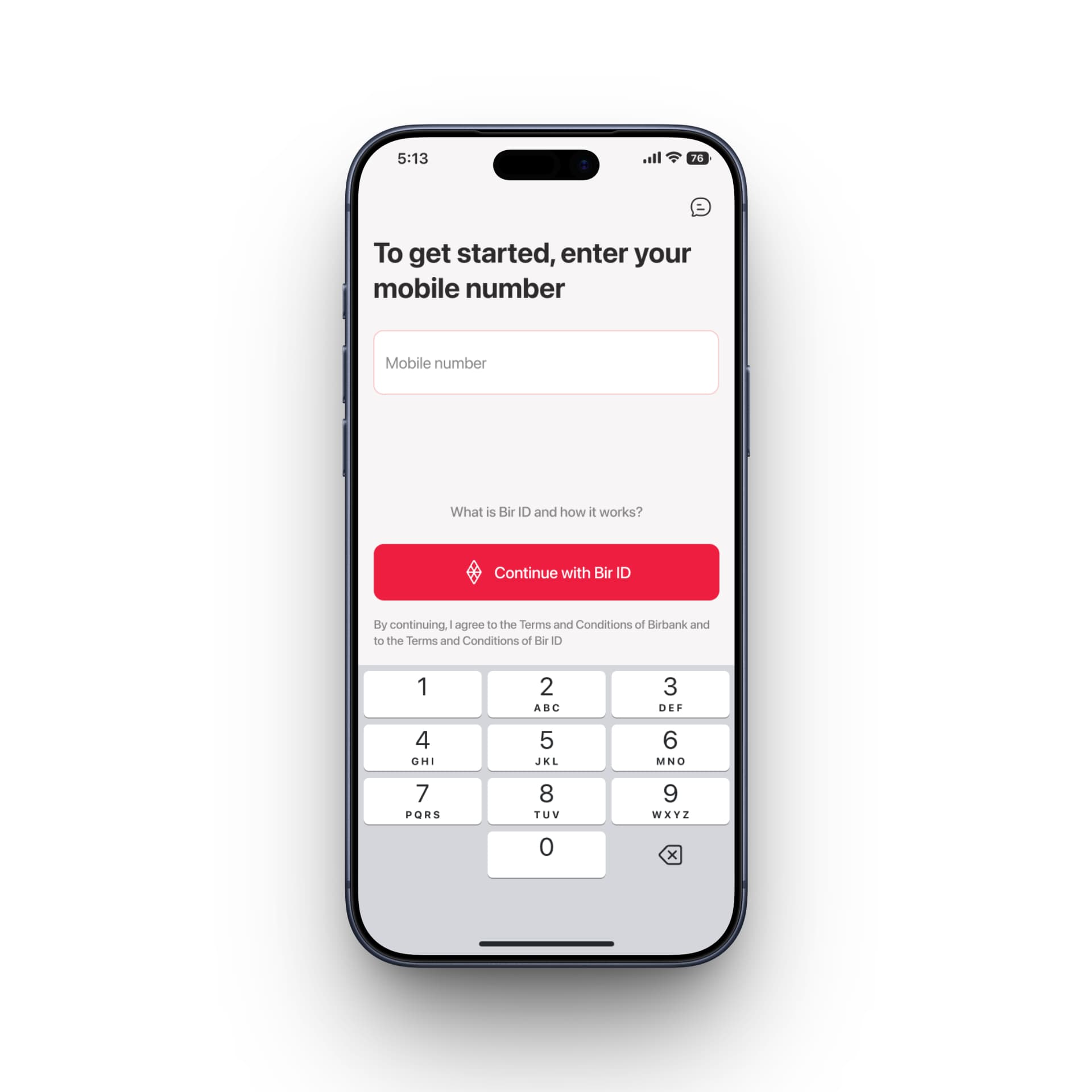
Birbank is Azerbaijan's leading fintech super-app and the main app of the Bir ecosystem. Its app opened on a single question: what is your mobile number?
For an existing customer that's one tap and a keypad. For everybody else it was a dead end. There was no way to see what a card cost, what a loan required, or whether any of it was worth the install — the only routes in were to create an account or buy a card. You had to become a customer to find out whether you wanted to be one.
That makes this a discoverability problem before it is a design one. An ecosystem nobody can look inside is an ecosystem nobody joins, and Birbank is the door to the rest of it. Nothing about the login screen was badly built; it was a good screen answering the wrong question for anyone who wasn't already a customer.
The constraint
One screen, whether or not anyone is behind it
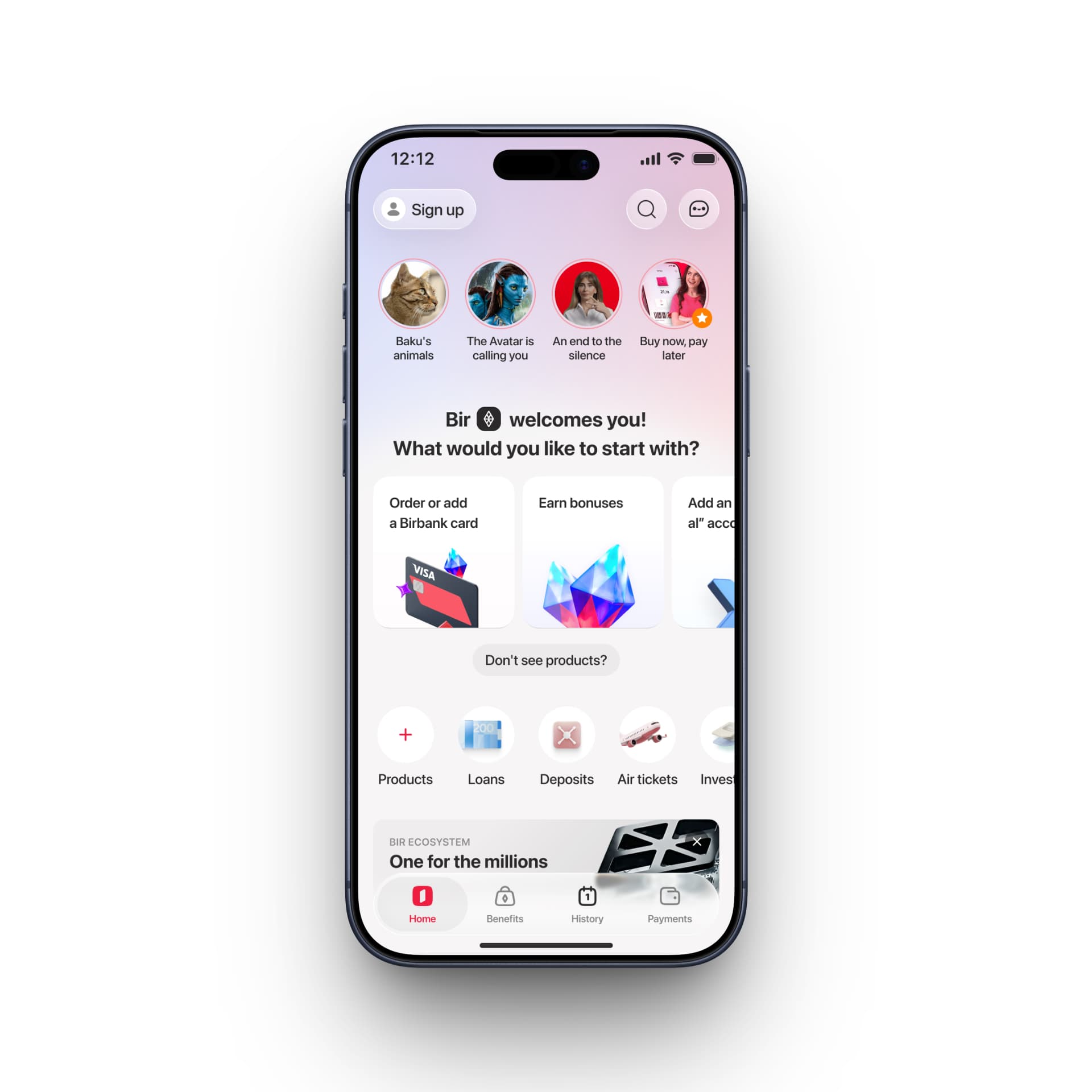
Guest mode is not a second app, and it isn't a preview of one. The guest home and the signed-in home are the same screen. Logging in doesn't replace it — it fills it.
That constraint is the entire design problem. A screen that only ever runs empty gets designed once and forgotten about. This one is the front door for every person who hasn't signed in yet and the daily surface for everyone who has, so it has to read as complete with nothing in it and then gain content rather than transform.
Two obvious answers fail that test. A marketing page isn't the app, so signing up becomes a bait-and-switch — you browse one thing and get handed another. The signed-in screen with everything greyed out is worse: an app full of disabled controls reads as broken, not as locked.
What shipped keeps the architecture whole and changes only what sits inside it. The tab bar is complete — Home, Benefits, History, Payments. So is the service row — Products, Loans, Deposits, Air tickets, Invest. A guest gets the real information architecture, not a reduced one, so the app they explore is the app they'd be signing up for.
Where the account summary sits for a customer, a guest gets a question — "Bir welcomes you! What would you like to start with?" — and the three most common first actions as cards: order or add a Birbank card, earn bonuses, open an account. The space that holds your balance holds the reason to have one.
Signing in also opens a feed below the fold, which a guest never reaches. That feed and the components it is assembled from are the rest of this study.
The ask
The wall didn't disappear, it moved
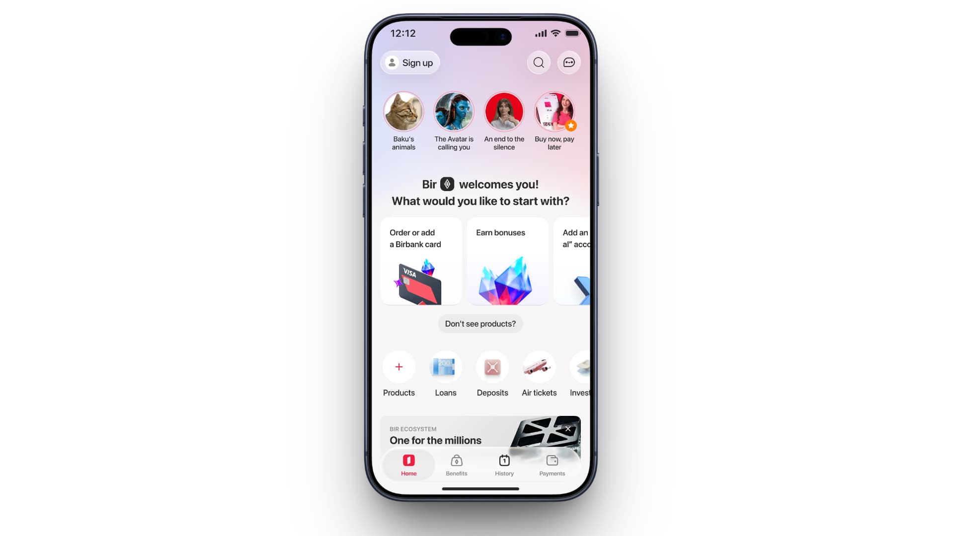
Sign up sits in the top-left corner, sized like the search and chat buttons beside it. Not a full-width call to action, not a modal, not a timer. It's on every screen and it blocks none of them.
That works because the gate falls somewhere honest instead. A guest can read what every product is and what it does — the browsing half of the app never needed to know who you are. The wall arrives at the point of commitment: tap apply for a loan and sign-up is the next step, because that is the first moment identity is genuinely required to continue.
So the wall didn't come down. It used to stand at the front door, before you knew what was behind it. Now it stands at the moment you've decided you want something — which is the first point where a stranger has a reason to hand over a phone number.
The feed
The same problem, one screen further down
Sign in and a feed appears below the fold: recommendations drawn from across the Bir ecosystem. A guest never reaches it.
Which makes it the same problem as the front door, moved inward. Guest mode exists because an ecosystem nobody can look inside is an ecosystem nobody joins — and once someone is inside, the rest of that ecosystem still has to reach them somehow. The feed is where it does.
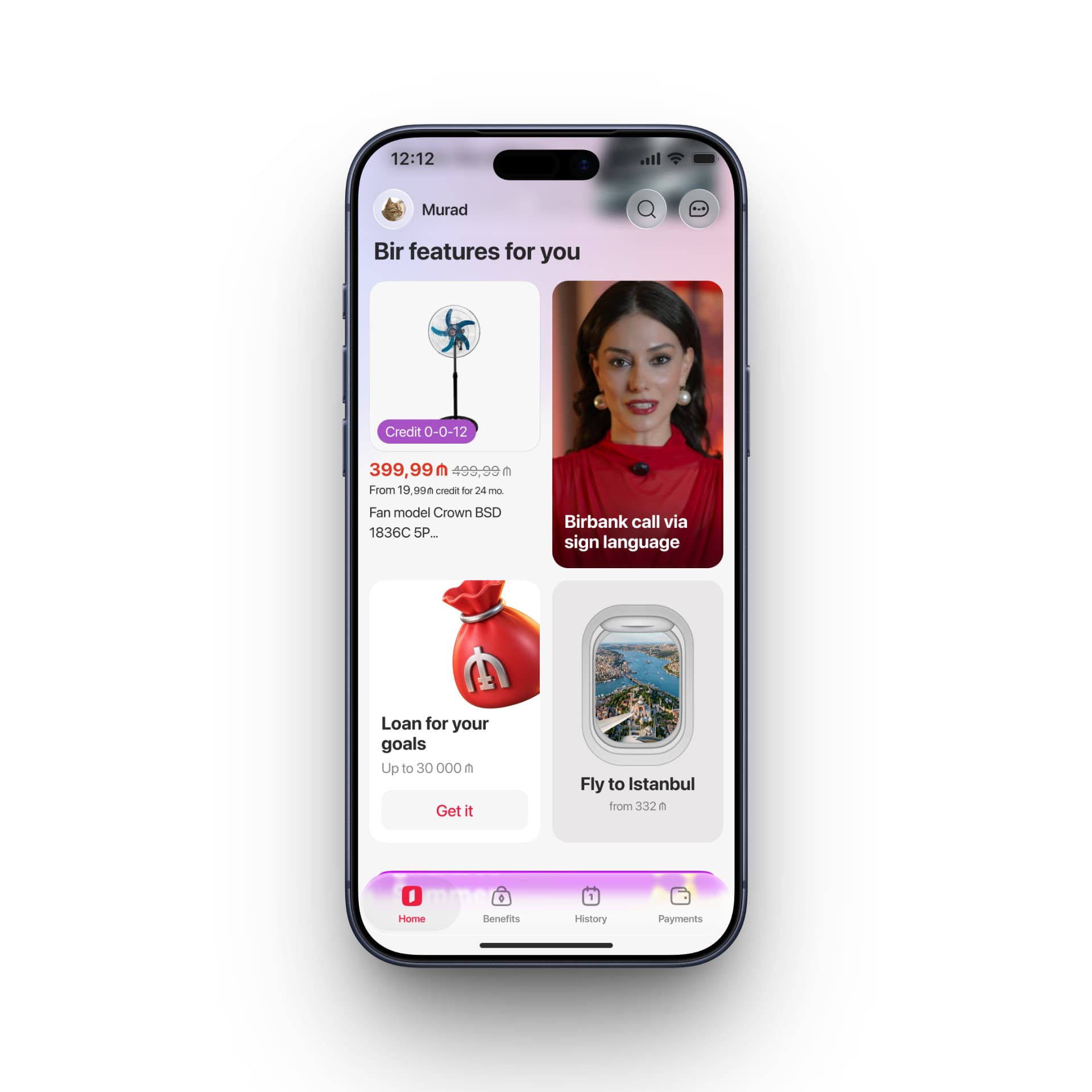
But a feed that can carry an instalment offer, a video, a loan and a flight is not a screen anyone draws once. It is a set of parts, and the parts are the work: banner types, each with its own anatomy, its own rules and its own states, documented so other designers can use them without asking.
Not eight components — one, with a Banner variant property carrying eight values:
Story · Product · Birmarket · Category · Special Partners · Travel · Partners · Article
That distinction is the whole argument. Eight components would be eight things to maintain, eight places for the padding to drift and eight ways for a new banner to be almost right. One component with a property means a merchant promo and a flight are the same object wearing different clothes, and a new type is a value rather than a file.
Two of the eight are documented and in production — Product, which carries the bank's own offers, and Travel. The rest are in development or still planned, which is the ordinary shape of a system that is being used while it is being built.
The property does not only change how a banner looks — it changes what a banner is. A Product resolves to a card with a button, and the button goes where the button goes. A Story resolves to a preview of a video or an image, and tapping it opens the story full-screen, the way an Instagram story does. Same slot in the feed, same component, two different kinds of object.
Both themes are live, and both are documented in the design system — the sheets above are not a proposal for dark mode, they are the reference another designer works from.
Where it stands
Shipping
Guest mode is in QA testing, and releasing soon. Designed and built; not yet in anyone's hands.
The banner system is further along: Product and Travel are in production in both themes, and the other six values are in development or planned.
Next project
Birbank Travel — Passenger Flow